
Parking Pass
UI/UX, Mobile Design, Interaction Design, iOS Concept
Overview
This case study was a solo project developed over the course of my last ten weeks as a product design student at DesignLab. As my final project, it was my goal to complete this study by applying all pieces of knowledge I’ve learned throughout the year. I identified and investigated a problem space, took it from board to hi-fidelity design and established an interactive prototype by using Sketch.
Problem
Parking issue has been a severe problem in Southern California, especially in Downtown Los Angeles. The challenge of finding on-street & off-street parking nearly anywhere in the city is painfully difficult.
Challenge
How might we provide a more convenient way to help people find available nearby parking spots, as well as ease and simplify their payment experience?
Research
The purpose of the research is to investigate user’s experience of parking. It aims to figure out what pain points, motivations and behaviors a handful of users have, and if they need an iOS Maps app extension to provide a parking solution for them.
User Interviews
To get a better understanding of the problem space, I conducted 5 rounds of user interviews with potential users. They are my target audiences who know how to drive, between 19 and 44 years old, and familiar with using the mobile phone.


User Polls
In addition to user interviews, I also conducted a quick user poll which consisted of two general questions regarding user’s parking behavior. A total of twenty participants provided responses for this poll and their feedback has been captured through pie charts to better understand the data and display the feedback more easily.
Summary of Findings
• People drive more frequently than they use ride share apps like Uber
• Only 9% of people who can legally drive actually never drive
• 16% of drivers prefer to use a ride share app like Lyft
• 45% of drivers who pay for a parking spot will remain parked in that spot until their time has expired
• 25% of drivers tend to pay additional money to extend their parking time
Competitive Market
Competitive analysis is a type of research designer use as a way to collect and compare data about products (and brands) in the marketplace. This method is often used to highlight strengths and weaknesses of products in order to make more informed decisions about our product strategy. It’s important to know that this type of analysis only tells designers what currently exists, not why it exists.
For this analysis, I’ve gathered the pros and cons of four leading parking apps in the marketplace today. This information helped keep me focused on which features were useful to the user and eliminate those that weren’t.

Honk
Pro: Displays fees for selected parking duration
Con: No information architecture and overcrowded parking labels on map

Spot Hero
Pro: Allows parking reservations far in advance
Con: Too many reservations may be confusing to users

PaybyPhone
Pro: Good visuals and information architecture
Con: Users are unable to search for nearby parking

BestParking
Pro: Displays street view of the parking space
Con: No information architecture leaving users unsure what to do next
Persona Development
Identifying and building out profiles of personas is one of the most important steps in a User Experience (UX) design project. Personas are archetypal users of the product or service that is being designed. By identifying and understanding the characteristics and needs of these users, we’re able to design a product that aligns with the behavior, motivations and interests of our users..
Parking Pass is a user-focused design, which means putting the user at the heart of our UX and UI Design process, and I’ve designed a product to meet our user’s needs, appeal to their preferences and enable them to complete tasks quickly and easily. In order to successfully do this, I first needed to get to know our users; therefore, I’ve built our persona, Tess. ,

Meet Tess
Goals
Spend less time finding parking
Find a parking garage for paid parking
Pain Points
Free parking is difficult to find in LA
She’s not the best at parallel parking
Motivations
To save time, convenience
Secured lot to park
Age 26 ● Taurus III ● Downtown, Los Angeles ● Upcoming Influencer ● 1.5 million followers
Tess is a rising YouTube influencer who lives her life to the fullest. When she’s not in the studio, she’s documenting her day-to-day routine. Her fan base has grown significantly over the last 12-months which has opened up a few brand deals as a paid influencer. She just moved to Downtown Los Angeles in her dream loft and loves everything about it, except for the parking situation. Since she lives in a renovated commercial building, her place didn’t come with any parking, which didn’t seem like a big deal when she signed her lease. However, Tess often finds herself wasting an average of 45-minutes daily, circling her block looking for parking which is a huge issue for her pressed schedule. Tess needs to find a parking solution quick or she will soon begin to look for a new place to call home.
Problem: Looking for a parking spot in Downtown
Tess’s Parking Journey
The user journey map below portrays a typical parking scenario for Tess. I created the map to empathize with Tess and thoroughly showcase her emotions, thoughts and actions during this parking trip. It’s important to remember that Tess experiences this exact scenario on a daily basis, which I found useful when I was extracting key points from Tess’s needs and pain points. Through this analysis, I was able to determine opportunities to incorporate in Parking Pass’s screen designs.

User Flow
There are many different pathways a user can take when interacting with a product. A user flow is a visual representation, either written out or made slightly digitally, of the. many avenues which can be taken. when using an app or website.

Task Flow
A task flow is a visual, linear map, showing the high-level steps a user would take to get to a specific goal or end point. Check out the roadmap below to follow one user’s journey while using Parking Pass.

Design Question
Between research insights and key user journey findings, I was able to get a clear and comprehensive understanding of the design challenge. The problem seemed big, yet simple. The common denominator was a struggle to find parking, whether it was free or paid.
How might I help drivers easily navigate parking in Los Angeles?
User Stories
To lay the building blocks for my initial design, I needed to brainstorm many possible scenarios of what Tess would potentially need from a solution. Brainstorming was helpful to generate lots of ideas. However, I needed to get organized, so I clustered stories into epics. Planning a trip naturally presented itself as the core function of the solution; finding parking.


Information Architecture
People often use the words, “Information Architecture” to describe the menus on a website or navigation in apps, however, using it in this context is actually incorrect. While a menu and navigation are a part of IA, they’re really only one part of it. Information Architecture is all about organization of information in a clear and logical way. Such organization follows a clear purpose - helping users navigate a complex information easily.

Lo-Fi Wireframes
Lo-fi wireframes are the blueprint for design. They connect the underlying structure (or information architecture) to the surface (or visual design) of a website or mobile app. Lo-fi wireframes do not represent the visual design or convey the brand or identity.

First Iteration Design
Based on my low fidelity wireframes above, I designed the most important screens for Parking Pass. These screens included a search for local parking based on the user’s end location, parking pricing, parking reservations, parking confirmation and lastly, directions to the user’s booked parking spot.


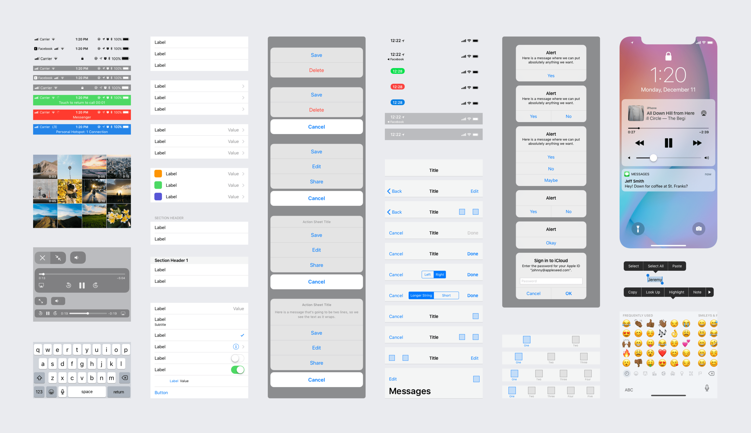
Interface Essentials
Using the iOS UIKit provided by Apple, I was able to create Parking Pass easily, making it adaptable to integrate smoothly into the Maps app. The interface elements provided by UIKit fit into three main categories:
Bars. Tell people where they are in your app, provide navigation, and may contain buttons or other elements for initiating actions and communicating information.
Views. Contain the primary content people see in your app, such as text, graphics, animations, and interactive elements. Views can enable behaviors such as scrolling, insertion, deletion, and arrangement.
Controls. Initiate actions and convey information. Buttons, switches, text fields, and progress indicators are examples of controls.
Parking Reserved
When designing the booking process for Parking Pass, I started by first identifying all necessary elements of user flows and the mobile information architecture. If a step in the process seemed redundant or irrelevant, it was eliminated from the designs after confirming my assumptions using the user feedback from my research. This actually resulted in the creation of a few variations of user flows before I came up with the design which captured all of the users wants and needs when using the app. My ultimate goal was to reduce the number of steps necessary to complete both spot reservation and payment process.
To accomplish the desired outcome, I used Apple’s familiar UI elements to create lo-fi wireframes and my first iteration designs. minimal, easy-to-use interface designed and wireframed new, intuitive interface for searching for a parking spot on homepage and reservations page. The search results were enriched with previously missing details. In the new solution, every listing item had a booking button next to it, compared to a single button at the bottom of sometimes extensive and long list. Additionally, I proposed enabling the map to be interactive so the users could click on the marker on the map directly to view selected parking spot details and book it right away.

Usability Findings

Participant A
Participant unable to easily find where to add her card or funds into her Parking Passport within the app.
Participant would like to easily access current and previous bookings, as well as easily reserve the same spot again for future reservations.
Would be useful if the map pins color coded available parking lots and garages based on free parking, permit parking and paid parking.

Participant B
Adding an internal countdown clock showing users how much time before their parking space expires would be ideal.
Participant would like to be reminded via mobile alert notifying them when their spot is about to expire.
The alert should also have options to extend the time and list the extended fee per minutes.

Participant C
Participant would like to add a feature which tells the driver the best times to park based on how crowded the lot or garage are per specific times of the day.
Would like to see the street view of the parking spot and structure to scope the neighborhood and area prior to reservations.

Participant D
Would be ideal if drivers could purchase parking permits for street parking directly through their parking pass.
Additionally, it would be ideal if driver’s could also renew parking permits through the parking pass as well.
Users would need to be notified via device alert letting them know their permits are soon expiring and prompt an easy renewal.
Second Iteration
Aside from adding a few more screens to the final design, some of the screens were adjusted as well. These revisions were motivated by the feedback received from participants during usability testing.
As requested, a new screen has been added for users to upload cards and funds into their accounts, an internal countdown timer displaying the amount of time left on their spot as well as a screen to easily access current and previous parking reservations.
In addition, from the reservation screen, users are now able to easily reserve a spot again and the alert displayed on the the user’s mobile device Lock Screen is now capable of supporting extended time based on the users need.
Lastly, the QR code confirmation screen has been updated to reflect the QR code, the spot location, floor, spot number and booking confirmation number so the user doesn’t need to go back to the reservation in order to easily find this information.


Final Thoughts
This case study had particularly piqued my interest because it’s a feature that I personally would use regularly living in Southern California. I was able to understand this project from the perspective as the user which helped me better approach Parking Pass’s overall designs. For future development, it’d be ideal to include parking permit registrations, bus and Metrolink passes, and all other forms of public transportation so that the user conveniently has all their access passes organized and stored within their Parking Pass.